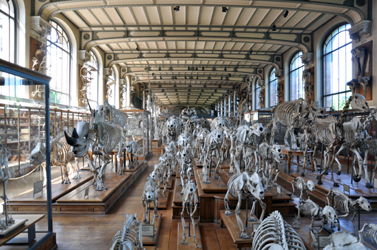
The Galeries de Paléontologie et d’Anatomie Comparée (Gallery of Paleontology and Comparative Anatomy) is a jewel. Part of the French Muséum national d’histoire naturelle (Natural Musuem of Natural History), it is located within the Jardin des Plantes in Paris near the metro stop for Gare d’Austerlitz.
The gallery, designed by French architect Frederic Dutert, was inaugurated in 1898 as part of the l’Expositions universelles de Paris of 1900 and was the creation of Professor of Paleontology Albert Guadry and Professor of Comparative Anatomy Georges Pouchet who wished to preserve and present to the public collections from the great expeditions of traveller-naturalists of the 18th and 19th centuries.


The sculpture at the entryway sets the tone right at the beginning – I don’t recall who did it but I thought it was awesomely awesome as a crazed monkey killing a guy could ever hope to be. Truth is, the sculpture is tame compared to some of the enjoyably odd things inside this museum. When we first decided to come here, this was purely us throwing a bone (zing!) to our daughter because she loves natural history museums and she asked to come to this one. I had no idea that I would enjoy the building as much as I did. After entering the building, I knew that despite my taste running more to the modern, this was a great space.


The building is done in a architectural style called ‘Naturalism’, sort of a generic term for Art Nouveau, Organic Architecture, and Expressionism. Art Nouveau was an anti-historical movement that was predominantly in Europe between 1890 and 1914, and as a style was developed by a generation, most likely as a response to the Industrial Revolution, who sought to create an art form appropriate to the new modern age.


Some of these artists, designers, and architects enthusiastically embraced the new technologies while others deplored the shoddiness of mass-produced machine-made goods and sought to elevate the decorative arts to the level of fine art by applying the highest level and standards of craftsmanship and design to everyday objects. The designers who flourished in this style rejected imitating past styles and focused rather on all the craft skills of the construction methods which were available. This included heavy use of colored artisanal ceramic, terra cotta and glass, wrought iron for slender lattice works and handrails, oriel windows, and heavy use of asymmetrical hierarchies. The Gallery of Paleontology and Comparitive Anatomy seems to have found a balance between the defining characteristics of the naturalism and the industrial periods, a match that works exceedingly well for it’s program and content.


I have included a guide to The Gallery of Paleontology so that if you want you can explore the contents of the collection you could. As I mentioned in the beginning, this was a building that wasn’t on my radar and our decision to come here was loosely based on a request from my daughter. She didn’t care about the building so much but she did enjoy looking at all the bones. Looking at “architecture” with a child will do several things for you, the least of which is distill down the aspects of what good architecture means for you. Seeing and experiencing things with my daughter has made me focus on space and lighting to a much higher degree than before when I focused most of my energies on detailing and connections, materiality and texture. When I have limited time to walk through a building and critically evaluate it, all I have to do is go back through the pictures I took and see for myself what I was most interested in while I was there.

.
Cheers

